Initializing System
Scholarship Portal

This isn’t just a scholarship website — it’s a two-sided system designed to handle real application workflows at scale.
The platform supports both applicants and internal administrators, each with completely different needs, interfaces, and data interactions — all within a single system.
What I Built
I developed the Nuxt frontend layer for both the applicant and admin experiences, integrating closely with a Laravel backend.
Instead of treating it like a typical form-based site, I approached it as a state-driven application, where:
- users don’t lose progress
- admins can process large volumes of data efficiently
- the UI adapts based on role and context
Key Decisions That Shaped the System
Designing for Two Completely Different Users
Applicants need clarity and guidance.
Admins need speed and control.
I separated concerns at the UI and component level, while keeping a shared architecture underneath — so the system stays maintainable without duplicating logic.
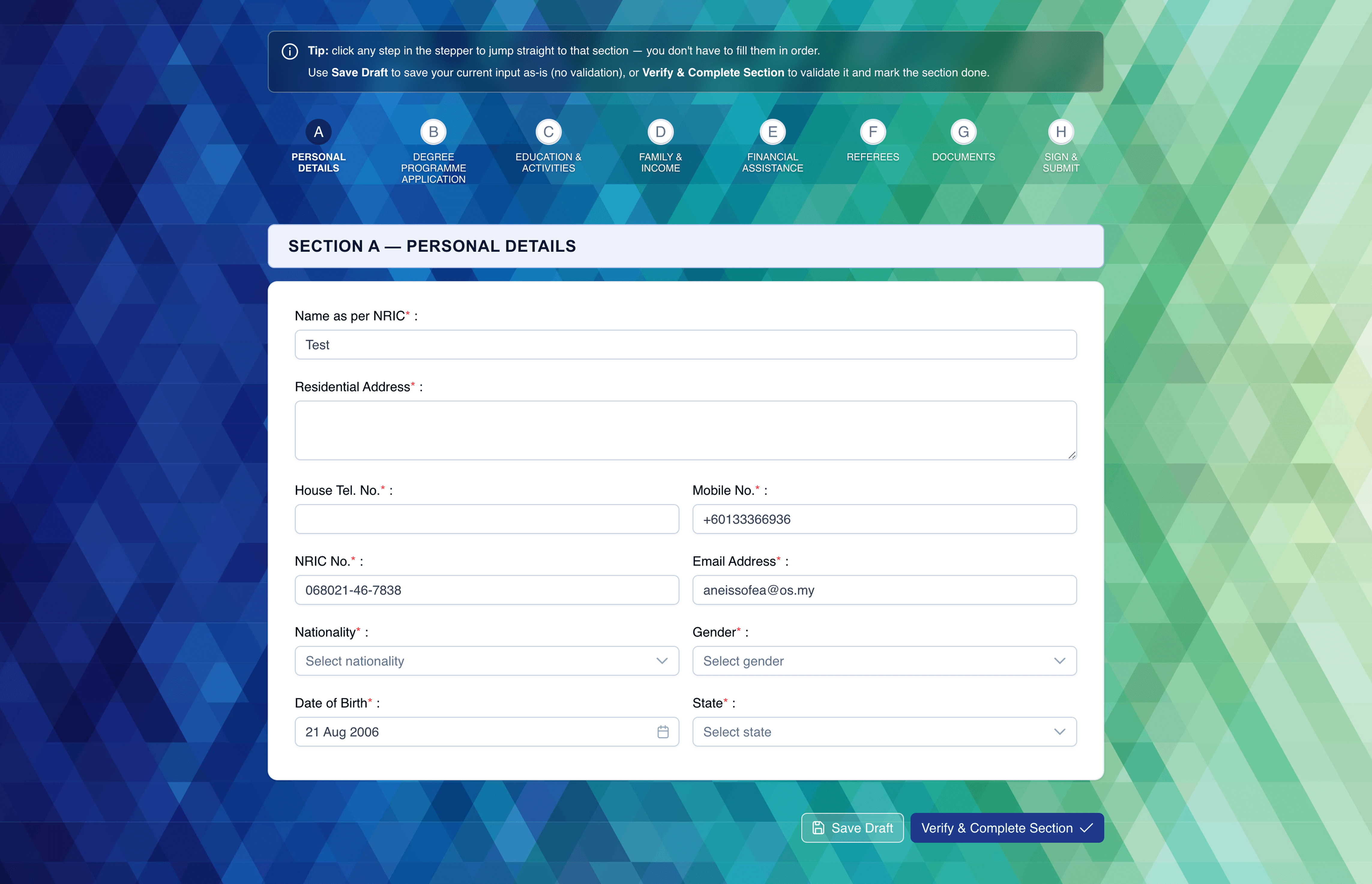
Turning a Long Form into a Usable Flow
Scholarship applications are naturally long and error-prone.
Instead of dumping everything into one page, I broke it into a multi-step flow with controlled progression, where:
- each step validates before moving forward
- data persists even if the session is interrupted
- users always know where they are in the process
Handling Real Data, Not Just Inputs
This wasn’t just “collect and submit”.
The form deals with:
- structured personal + academic data
- document uploads
- conditional inputs depending on user responses
I built reusable form patterns to handle these consistently, instead of hardcoding one-off solutions.
Admin Experience = Data Navigation, Not Pretty UI
The admin panel is where the real complexity lives.
I focused on making large datasets usable:
- filtering and scanning applications quickly
- clear status visibility
- minimizing friction when reviewing entries
Technical Notes
- Nuxt-based frontend with modular component structure
- Laravel API integration
- Role-aware rendering (not just route-based protection)
- Persistent form state handling
- Reusable input + validation patterns
Challenges I Actually Had to Solve
Keeping Forms Reliable Across Sessions
Multi-step forms tend to break when users refresh or navigate away.
→ I implemented controlled state persistence so progress isn’t lost mid-way.
Avoiding “Admin UI Fatigue”
Data-heavy dashboards can easily become slow or overwhelming.
→ I prioritised clarity and scan-ability over decoration — making the interface fast to use, not just nice to look at.
Result
A system that behaves less like a website and more like a working tool — something both applicants and internal teams can rely on without friction.